
이번 실습은 MotionLayout과 CoordinateLayout을 적용시켜 보았다.
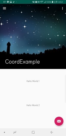
1) 귀여운 케릭터를 이용하여 Splash화면을 구현해 보았다.
Splash화면은 MotionLayout을 통해 케릭터가 역동적으로 움직 일 수 있게 해주 었고
2) HomeFragment의 상단 앱바는 CoordinateLayout을 통해 스크롤 시 사라지게 해주었다.
1) Splash 화면 구현
<?xml version="1.0" encoding="utf-8"?>
<manifest xmlns:android="http://schemas.android.com/apk/res/android"
    package="com.example.motionlayout_practice" >
    <uses-permission android:name="android.permission.INTERNET" />

    <application
        android:allowBackup="true"
        android:icon="@mipmap/ic_launcher"
        android:label="@string/app_name"
        android:roundIcon="@mipmap/ic_launcher_round"
        android:supportsRtl="true"
        android:theme="@style/Theme.MotionLayout_practice" >
        <activity
            android:name=".SplashScreen"
            android:exported="true" >
            <intent-filter>
                <action android:name="android.intent.action.MAIN" />

                <category android:name="android.intent.category.LAUNCHER" />
            </intent-filter>
        </activity>
        <activity android:name=".MainActivity"></activity>
    </application>

</manifest>
먼저 Manifast에 intent-filter를 splashActivity로 바꾸어 준다. 그러면 앱이 시작하면 SplashActivity가 실행이 된다.
그리고 splashActivity가 끝이나면 어떻게 MainActivity로 넘어 갈 수 있게 구현해 주어야 한다. 여기서 필요한건 Handler()이다.
package com.example.motionlayout_practice

import android.content.Intent
import android.os.Bundle
import android.os.Handler
import androidx.appcompat.app.AppCompatActivity
import androidx.core.os.postDelayed
import com.example.motionlayout_practice.databinding.SplashScreenBinding

class SplashScreen : AppCompatActivity() {
    private val splashDuration = 2500L

    override fun onCreate(savedInstanceState: Bundle?) {
        super.onCreate(savedInstanceState)
        setContentView(R.layout.splash_screen)

        // Handler()를 통해서 UI 쓰레드를 컨트롤 한다.
        // Handler().postDelayed(딜레이 시간){딜레이 이후 동작}
        //      postDelayed()를 통해 일정 시간(딜레이 시간)동안 쓰레드 작업을 멈춘다.
        //      {딜레이 이후 동작}을 통해 딜레이 시간 이후, 동작을 정의해준다.
        Handler().postDelayed(splashDuration) {
            val intent = Intent(this, MainActivity::class.java)
            startActivity(intent)
            finish()
        }

    }
}
1) Handler()를 통해서 UI 쓰레드를 컨트롤 한다.
2) Handler().postDelayed(딜레이 시간){딜레이 이후 동작}
3) postDelayed()를 통해 일정 시간(딜레이 시간)동안 쓰레드 작업을 멈춘다.
4) {딜레이 이후 동작}을 통해 딜레이 시간 이후, 동작을 정의해준다.
1-2) MotionLayout설정
<?xml version="1.0" encoding="utf-8"?>
<androidx.constraintlayout.motion.widget.MotionLayout xmlns:android="http://schemas.android.com/apk/res/android"
    xmlns:app="http://schemas.android.com/apk/res-auto"
    xmlns:tools="http://schemas.android.com/tools"
    android:id="@+id/motionLayout"
    android:layout_width="match_parent"
    android:layout_height="match_parent"
    app:layoutDescription="@xml/splash_screen_scene">


    <ImageView
        android:id="@+id/imgView"
        android:layout_width="250dp"
        android:layout_height="300dp"
        android:contentDescription="TODO"
        android:src="@drawable/cute"
        app:layout_constraintBottom_toBottomOf="parent"
        app:layout_constraintEnd_toEndOf="parent"
        app:layout_constraintStart_toStartOf="parent"
        app:layout_constraintTop_toTopOf="parent"
        tools:ignore="ImageContrastCheck" />


</androidx.constraintlayout.motion.widget.MotionLayout>

MotionLayout을 쉽게 적용하는 방법은 아래와 같다.

우측상단 Design을 눌러 MotionLayout을 설정할 start와 end가운데에 위치한 화살표를 눌러 원하는 이벤트 처리를 해준다.
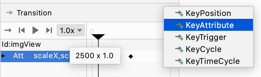
위와같이 KeyAttribute를 생성해주면 여러 효과를 넣어줄 수 있다.

여기서 Position은 0부터 100까지 중 하나의 정수이고 50이면 50%의 지점시 scale또는 X,Y의 위치값을 변경시켜준다. 라는 의미로 생각할 수 있다. 여러 Atrribute를 설정하여 넣어줄 수 있다.
나는 케릭터가 작아졌다가 커지는 효과를 만들기 위해 Position 25 50 100 세가지에 Attribute ScaleX, scaleY를 각각 0.7 / 1.2 / 5.0 이런식으로 설정해주었다. 1 일경우는 원래 케릭터 이미지의 크기이다

이렇게 설정해주면 res-xml에 파일이 하나 생성이 된다.
<?xml version="1.0" encoding="utf-8"?>
<MotionScene xmlns:android="http://schemas.android.com/apk/res/android"
    xmlns:app="http://schemas.android.com/apk/res-auto">

    <Transition
        app:constraintSetEnd="@id/end"
        app:constraintSetStart="@+id/start"
        app:autoTransition="animateToEnd"
        app:duration="2500">
        <KeyFrameSet >
            <KeyAttribute
                app:motionTarget="@+id/imgView"
                app:framePosition="20"
                android:scaleX="0.7"
                android:scaleY="0.7" />
            <KeyAttribute
                app:motionTarget="@+id/imgView"
                app:framePosition="50"
                android:scaleX="1.2"
                android:scaleY="1.2" />
            <KeyAttribute
                app:motionTarget="@+id/imgView"
                app:framePosition="100"
                android:scaleX="3"
                android:scaleY="3" />
        </KeyFrameSet>
    </Transition>


    <ConstraintSet android:id="@+id/start">
        <Constraint android:id="@+id/imgView" />
    </ConstraintSet>

    <ConstraintSet android:id="@+id/end">
        <Constraint android:id="@+id/imgView" />
    </ConstraintSet>

</MotionScene>
이렇게 간단하게 MotionLayout을 만들어줄 수 있다.
2. Coordinatorlayout
<androidx.coordinatorlayout.widget.CoordinatorLayout xmlns:android="http://schemas.android.com/apk/res/android"
    xmlns:app="http://schemas.android.com/apk/res-auto"
    xmlns:tools="http://schemas.android.com/tools"
    android:layout_width="match_parent"
    android:layout_height="match_parent"
    android:fitsSystemWindows="true"
    tools:context=".home_fragment">


        <com.google.android.material.appbar.AppBarLayout
            android:id="@+id/appBar"
            android:fitsSystemWindows="true"
            android:layout_width="match_parent"
            android:layout_height="wrap_content"
            android:background="@android:color/holo_green_dark">

            <androidx.appcompat.widget.Toolbar
                android:id="@+id/toolBar"
                android:layout_width="match_parent"
                android:layout_height="wrap_content"
                app:layout_scrollFlags="scroll|enterAlways">

                <FrameLayout
                    android:layout_width="match_parent"
                    android:layout_height="wrap_content"
                    >

                    <View
                        android:id="@+id/toolbarBackgroundView"
                        android:layout_width="match_parent"
                        android:layout_height="match_parent"
                        android:background="@android:color/holo_green_dark"
                        />

                    <androidx.constraintlayout.widget.ConstraintLayout
                        android:id="@+id/toolbarContainer"
                        android:layout_width="match_parent"
                        android:layout_height="?attr/actionBarSize"
                        >

                        <TextView
                            android:id="@+id/logoTextView"
                            android:layout_width="120dp"
                            android:layout_height="wrap_content"
                            android:gravity="center"
                            android:scaleType="centerCrop"
                            android:text="Photos"
                            android:textColor="@android:color/holo_orange_dark"
                            android:textSize="24sp"
                            android:textStyle="bold"
                            app:layout_constraintBottom_toBottomOf="parent"
                            app:layout_constraintEnd_toEndOf="parent"
                            app:layout_constraintStart_toStartOf="parent"
                            app:layout_constraintTop_toTopOf="parent" />

                        <TextView
                            android:layout_width="wrap_content"
                            android:layout_height="wrap_content"
                            android:layout_marginEnd="16dp"
                            android:text="로그인"
                            android:textColor="@android:color/white"
                            app:layout_constraintBottom_toBottomOf="parent"
                            app:layout_constraintEnd_toEndOf="parent"
                            app:layout_constraintTop_toTopOf="parent" />

                    </androidx.constraintlayout.widget.ConstraintLayout>

                </FrameLayout>
            </androidx.appcompat.widget.Toolbar>
        </com.google.android.material.appbar.AppBarLayout>


    <androidx.recyclerview.widget.RecyclerView
        android:id="@+id/itemRecyclerView"
        android:orientation="vertical"
        app:layout_behavior="@string/appbar_scrolling_view_behavior"
        android:layout_width="match_parent"
        android:layout_height="wrap_content"
        android:layout_marginBottom="50dp"
        />


</androidx.coordinatorlayout.widget.CoordinatorLayout>
Appbar가 스크롤시 사라지게 되는데 위와같이 간단하게 만들어 줄 수 있다.
ㅁ coordinatorlayout
ㄴ> appbarLayout
ㄴ> toolbar
ㄴ> FrameLayout
가장 중요한 것은
<androidx.appcompat.widget.Toolbar
    android:id="@+id/toolBar"
    android:layout_width="match_parent"
    android:layout_height="wrap_content"
    app:layout_scrollFlags="scroll|enterAlways">
toolbar에 scroolFlag부분이다.
다음과 같은 종류가 있다
| scroll | 스크롤 이벤트에 반응할 모든 view에 반드시 이 플래그를 설정해야 합니다. 그렇지 않으면 화면상단에 고정되어 있게 됩니다. |
| enterAlways | 아래 방향으로 스크롤 할때마다 이 보기가 표시됩니다. ('quitk return') |
| exitUntilCollapsed | 해당뷰에 minHeight를 정의하고 있으면, Toolbar가 해당 크기 까지만 축소가 됩니다. (가장 많이 사용됩니다.) |
| enterAlwaysCollapsed | 해당뷰에 minHeight속성의 크기로 시작해 맨위로 스크롤이 될때만 전체 높이로 확장하게 됩니다. |
다음은 이미지뷰를 스크롤하여 상단까지 올리는 경우를 보았는데 공부하기 좋은 경우라 같이 실습해보았다.
<com.google.android.material.appbar.CollapsingToolbarLayout

android:layout_width="match_parent"
android:layout_height="wrap_content"
android:minHeight="100dp"
app:contentScrim="@android:color/transparent"
app:layout_scrollFlags="scroll|exitUntilCollapsed">
그리고 CollapsingToolbarLayout에 app:contentScrim 속성을 사용하여 최소화 되었을때 툴바의 색상을 변경 할 수 있다.
그 다음으로 살펴봐야하는 속성은 app:layout_collapseMode 속성이다.
이 속성은 Toolbar 안에 설정하며, 스크롤이 발생했을 때 Toolbar의 최종 형태를 결정하는 역할을 한다.
이미지를 사용했을 경우, ImageView에도 속성을 넣어주어야 한다.
| pin | CollapsingToolbarLayout이 완전히 축소되면 툴바는 화면위에 고정된다. |
| parallax | 툴바가 축소되는 동안 Parallax모드로 동작하도록 한다. 옵션으로 layout_collapseParallaxMultipler 속성을 사용하면 transition의 translation Multiplier를 설정할 수 있다. (예 : app:layout_collapseParallaxMultiplier="0.7") |
<ImageView
android:id="@+id/ivToolbar"
android:layout_width="match_parent"
android:layout_height="wrap_content"
android:fitsSystemWindows="true"
android:scaleType="centerCrop"
android:src="@drawable/test"
app:layout_collapseMode="parallax"/>

<androidx.appcompat.widget.Toolbar

android:id="@+id/toolbar"
android:layout_width="match_parent"
android:layout_height="?attr/actionBarSize"
app:layout_collapseMode="pin"
app:popupTheme="@style/AppTheme.PopupOverlay" />
이렇게 하면 스크롤이 발생하며 본문의 내용을 위로 올렸을 때 툴바가 작아지면서 상단에 고정된다.
CollapsingToolbarLayout에서 app:contentScrim="@android:color/transparent" 로 지정하였으므로, 툴바가 닫혔을 때 투명색으로 변해 이미지뷰가 툴바에 보이게 된다. (이렇게하지 않으면 기본 툴바 색으로 나온다.)
위 스샷의 왼쪽은 스크롤 안한상태, 아래는 모두 한 상태이다.

출처: https://one-delay.tistory.com/68
'안드로이드 > 정리(Android)' 카테고리의 다른 글
| Android - MVVM 패턴 적용해보기 With Room (0) | 2022.04.06 |
|---|---|
| 코틀린 문법 공부 (0) | 2022.03.18 |
| kotlin - retrofit을 이용한 레시피 검색 앱 만들기 (0) | 2022.03.06 |
| Android - RecyclerView와 Retrofit을 사용한 Api 불러오기 (0) | 2022.03.04 |
| Android - ViewPager2, RecyclerView , NavigationLayout 사용하기 (0) | 2022.03.03 |